Context
Egg Farmers of Alberta has published its annual report with WJ for over a decade. Each edition informs members and stakeholders while carrying a story that stays consistent from year to year.
The challenge
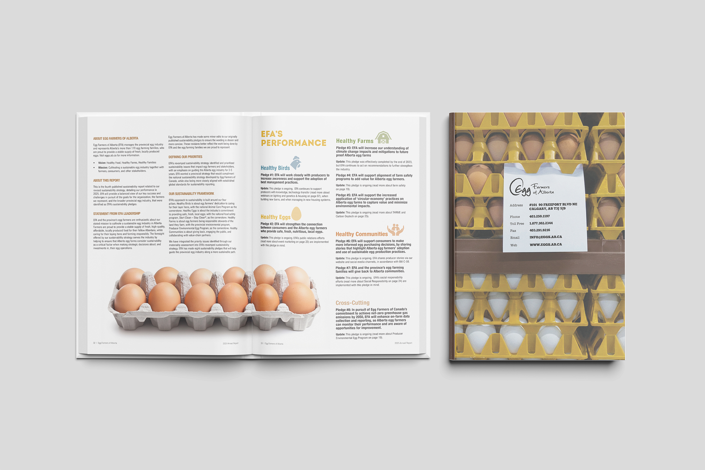
For 2025 the brand system was fixed: same colours, typefaces and pillar icons. The report had to feel new without breaking continuity. I led the concept, cover and layout system; print production was handled by the agency team.
Cover
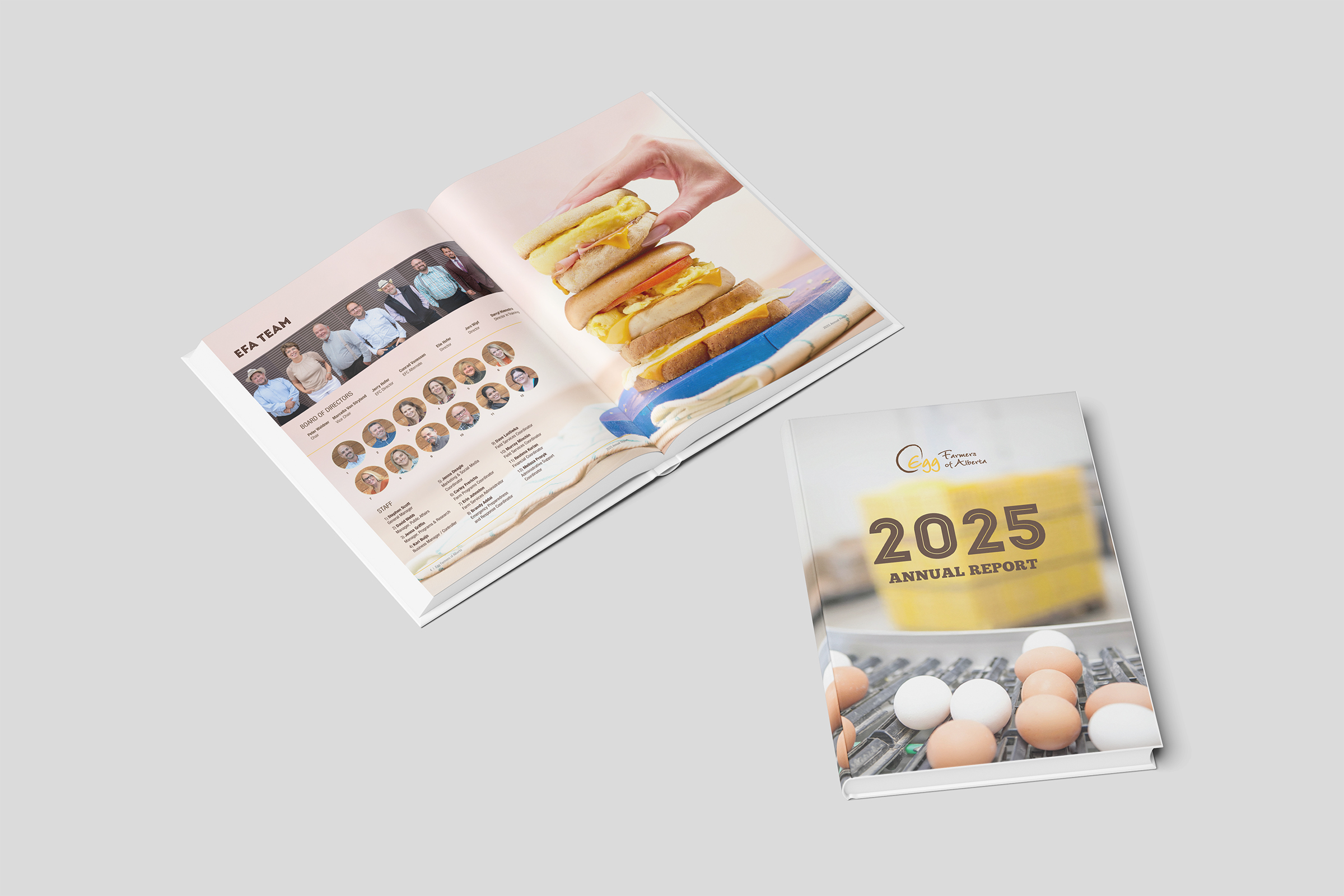
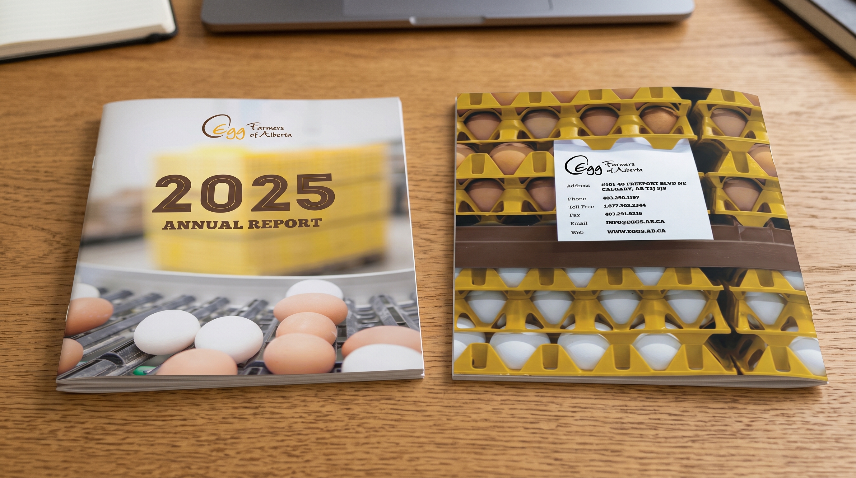
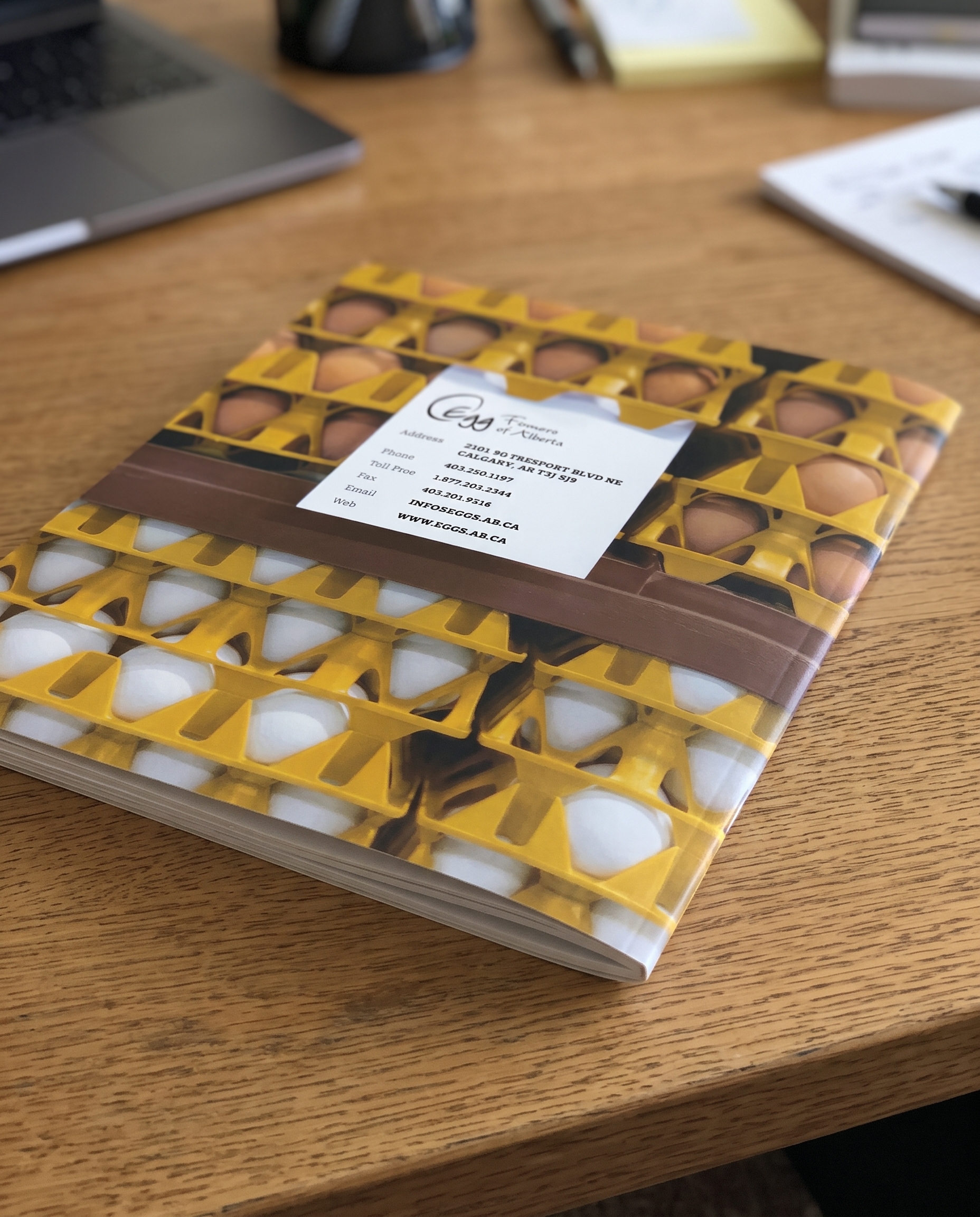
I kept the system and changed the tone. Earlier covers leaned on a rustic, pastoral image of farming. The 2025 report describes an industry in growth and transition, so the cover moved to the production line and let typography lead. Dark wood textures gave way to lighter surfaces and cream backgrounds.

Inside pages
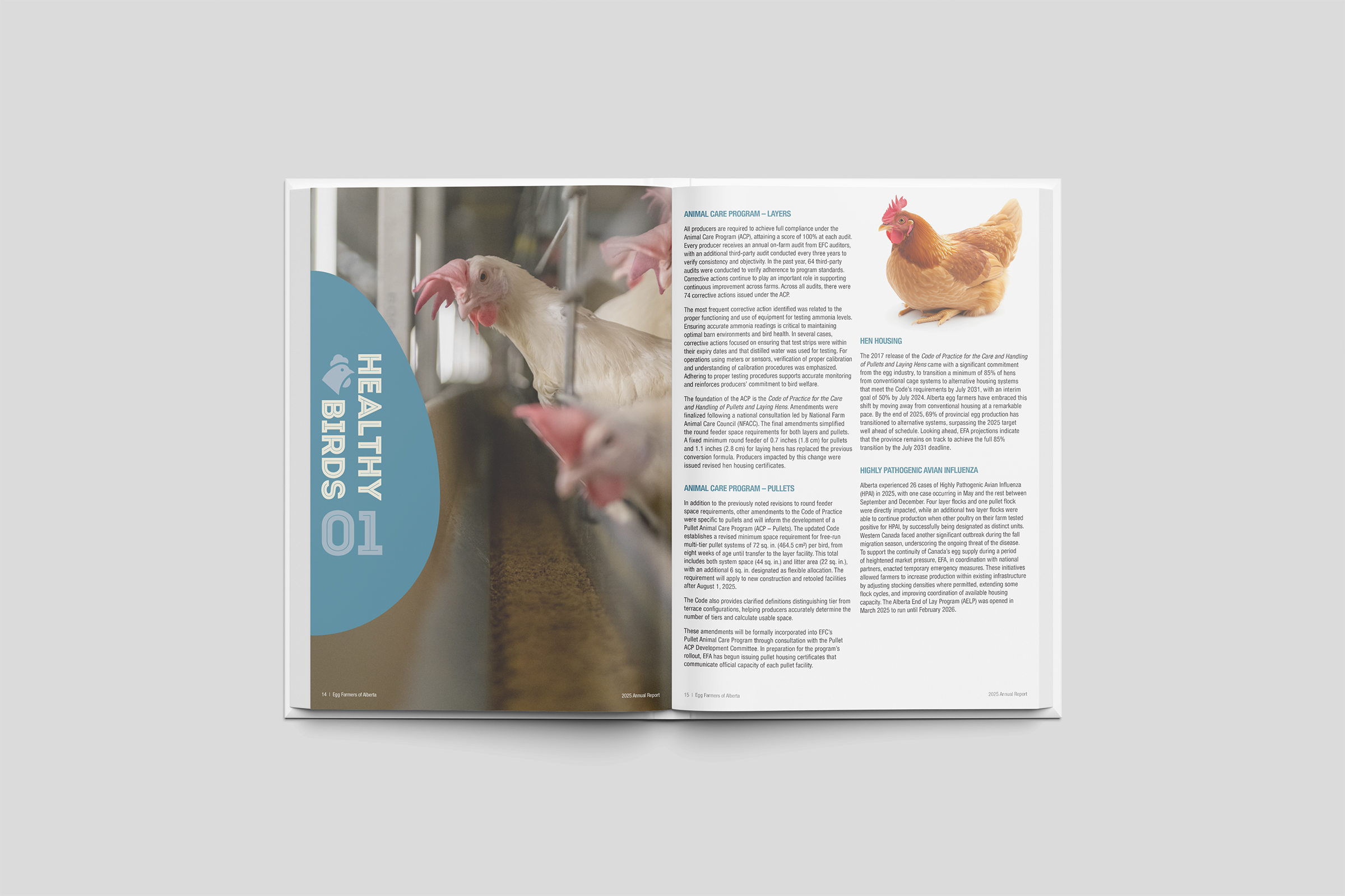
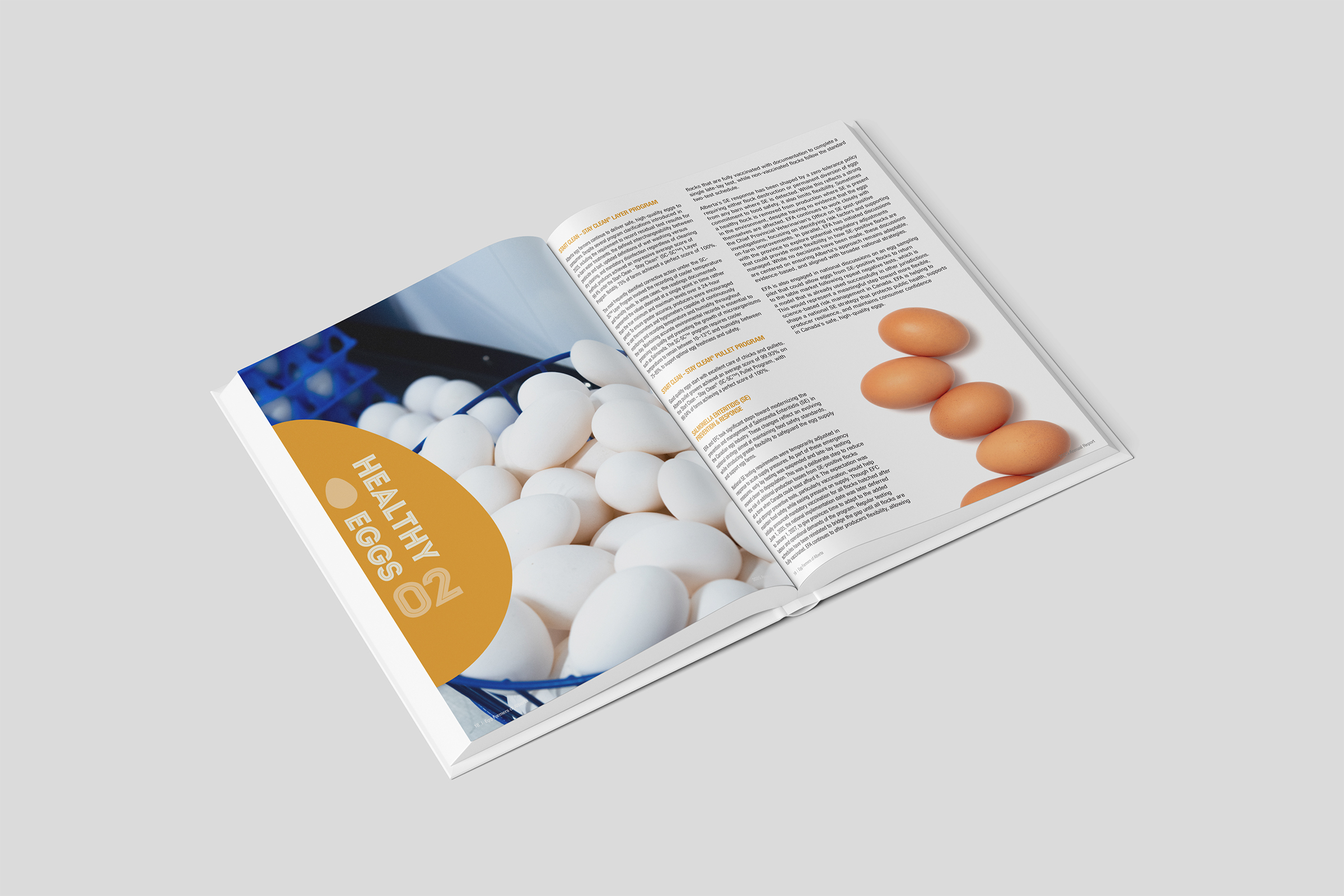
I also rebuilt the editorial architecture. Each chapter used to start on a page already full of content. In 2025, every chapter opens on its own full-bleed page, with a curve drawn from the outline of an egg, vertical type and a colour for each pillar. The system guides the reader through nearly 50 pages.
Kept: colours · typefaces · pillar icons
Changed: cover concept · chapter architecture · page layouts · overall atmosphere