Context
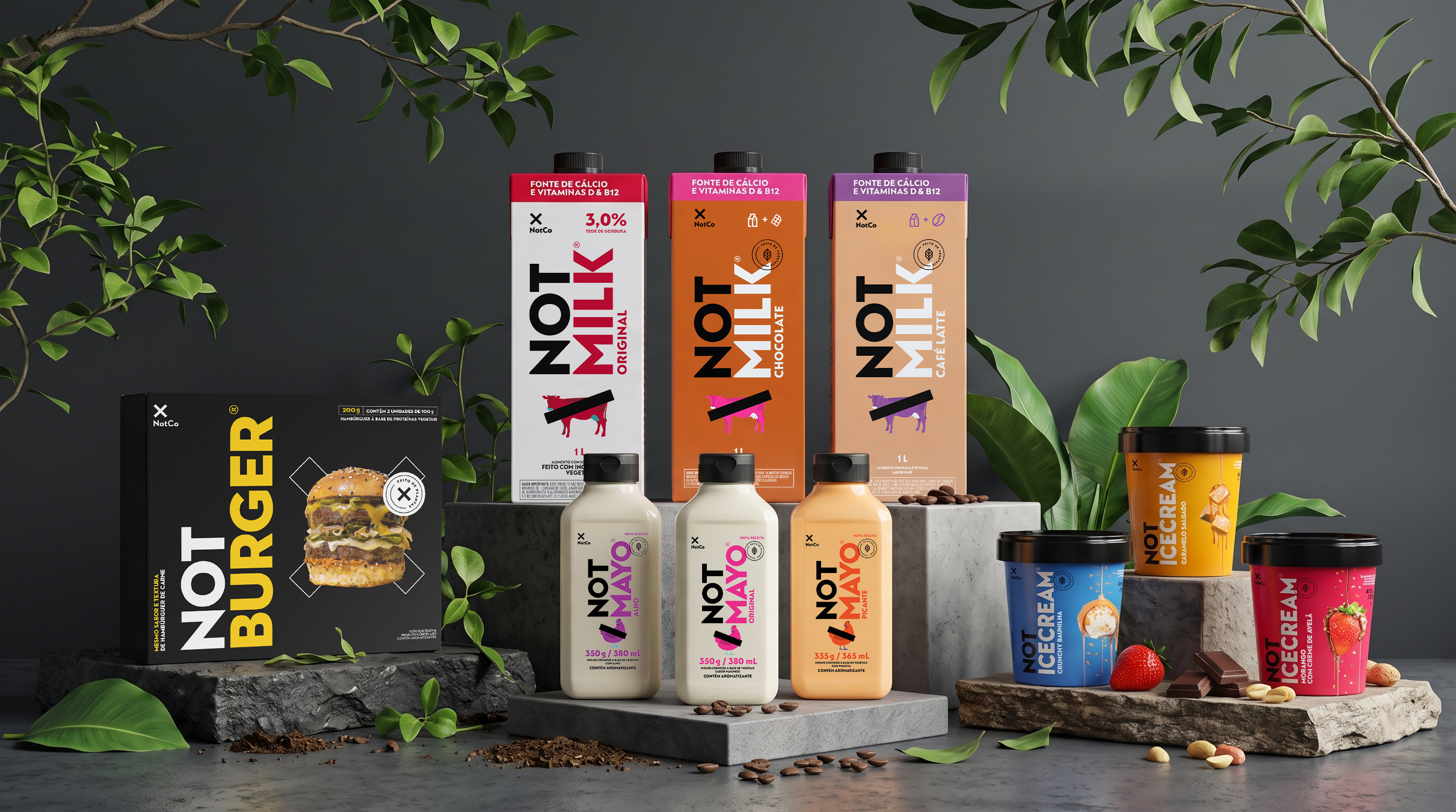
When I joined NotCo, the Brazilian line had three products, NotMilk, NotMayo and NotIceCream, all in packaging translated straight from the global design. As lead designer in Brazil, reporting to the global team, I redesigned them for the local market and later adapted NotBurger. I also designed the packaging for four products made only for Brazil: NotMilkinho, NotChicken, NotChicken Burger and NotChickenzitos, each approved by the global team.
Constraint
The brand was young and had no guidelines yet. I started two months before the pandemic, so most of the work was done remotely, with final approval from the global team.
Packaging
Two decisions changed how the line looked on shelf. On NotMilk, each flavour’s colour appeared only in the type; I extended it across the back of the carton, so the flavour carries through the whole pack. The change was later adopted outside Brazil. NotIceCream came in stickered plastic tubs. I pushed for paper, the format the category leaders use, and it launched in paper.
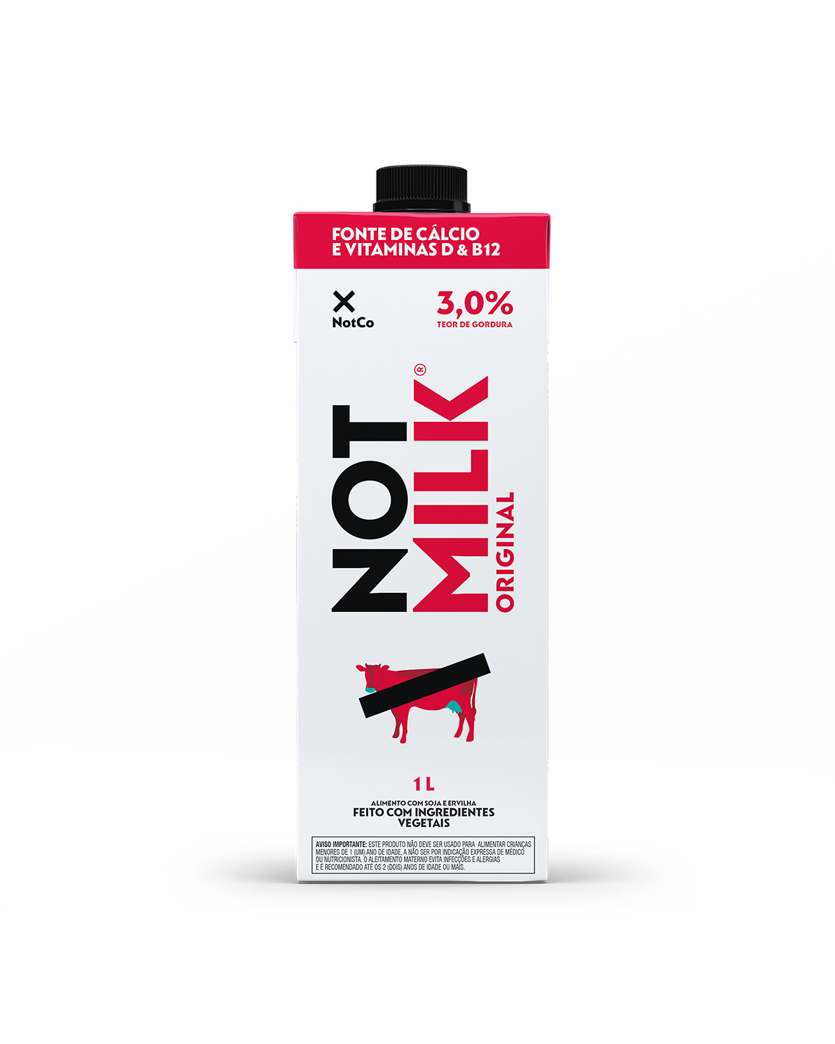
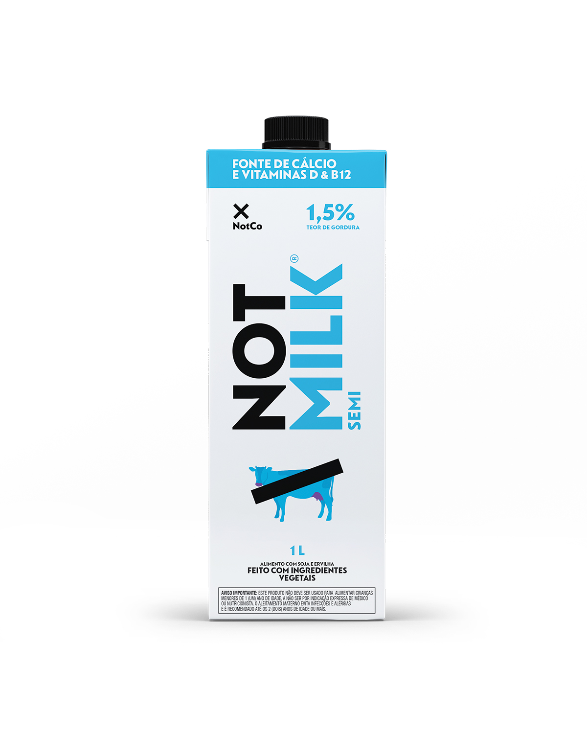
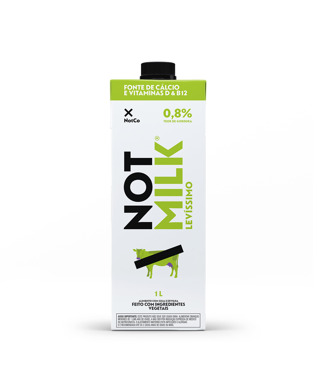
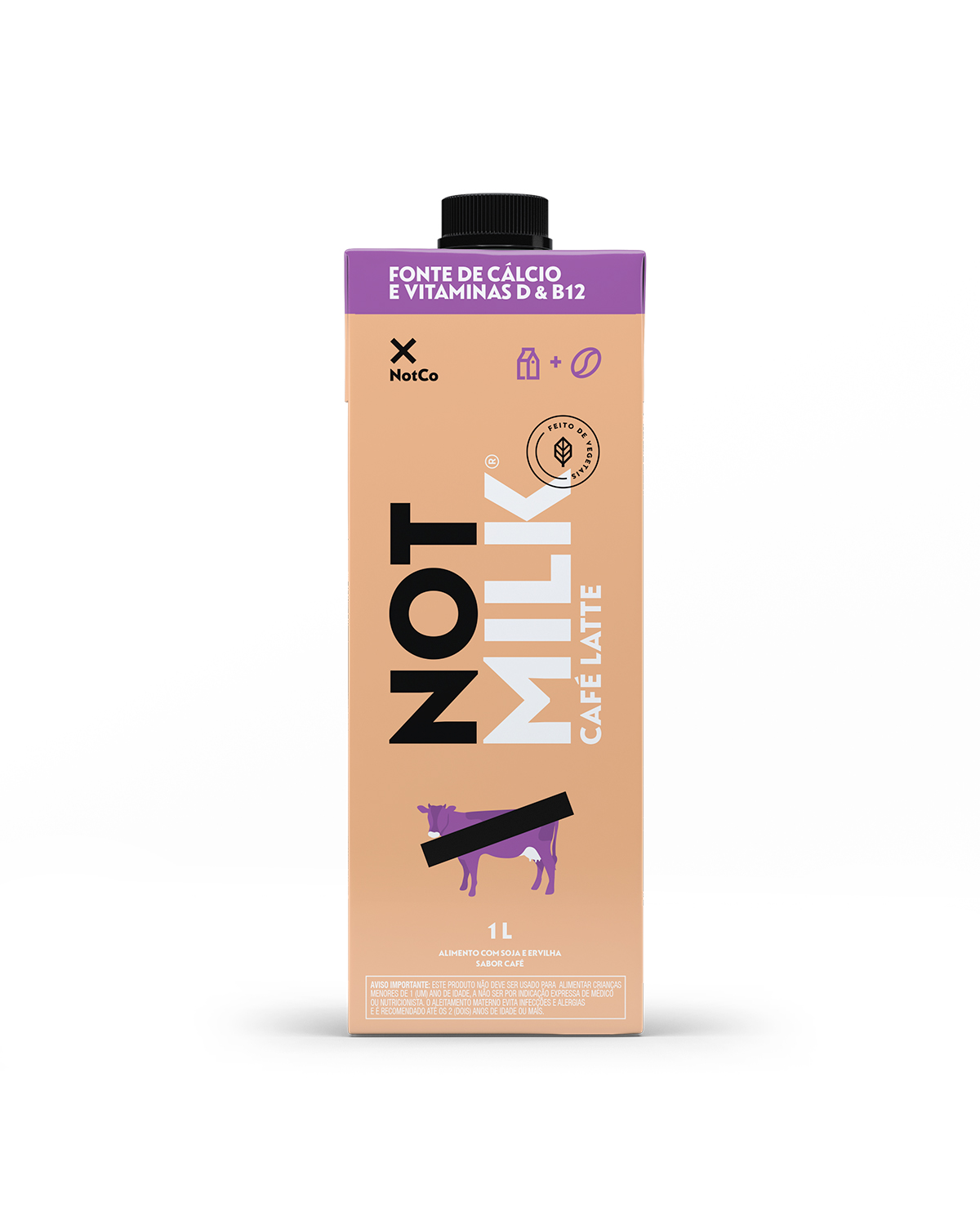
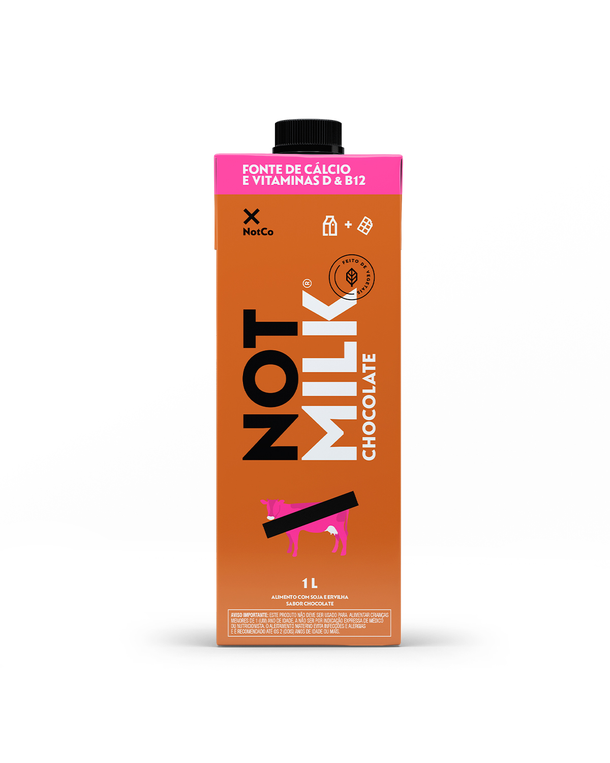
NotMilk
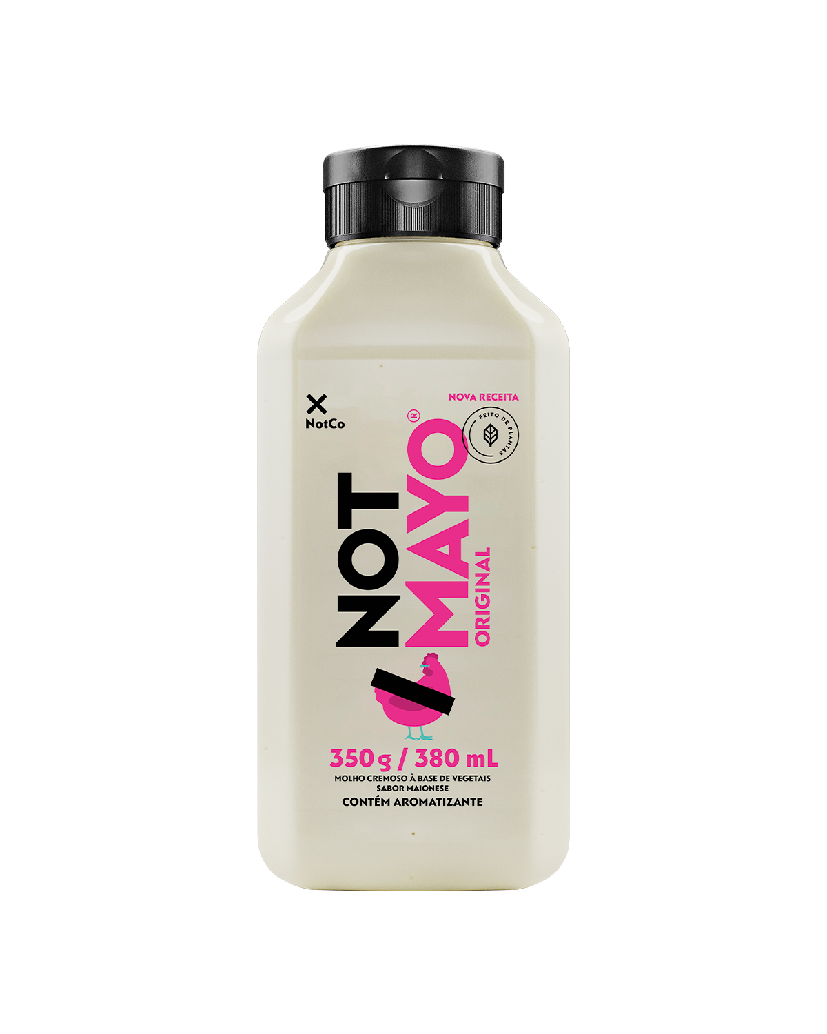
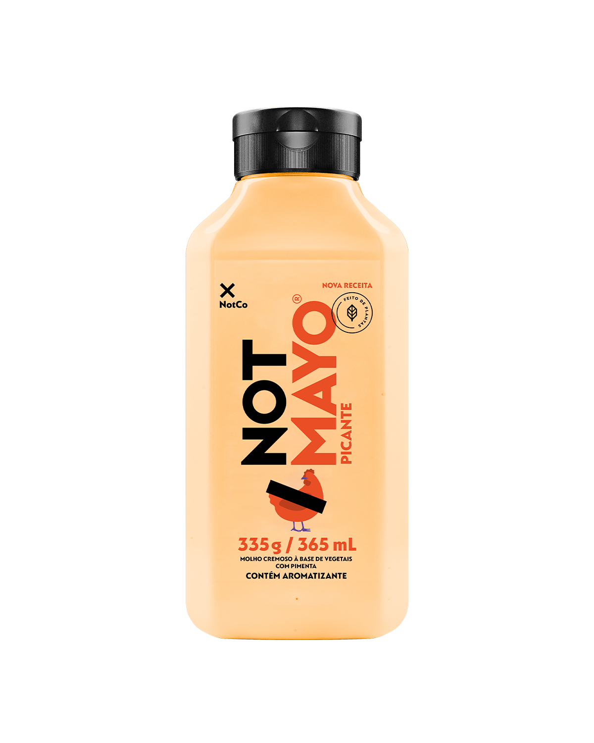
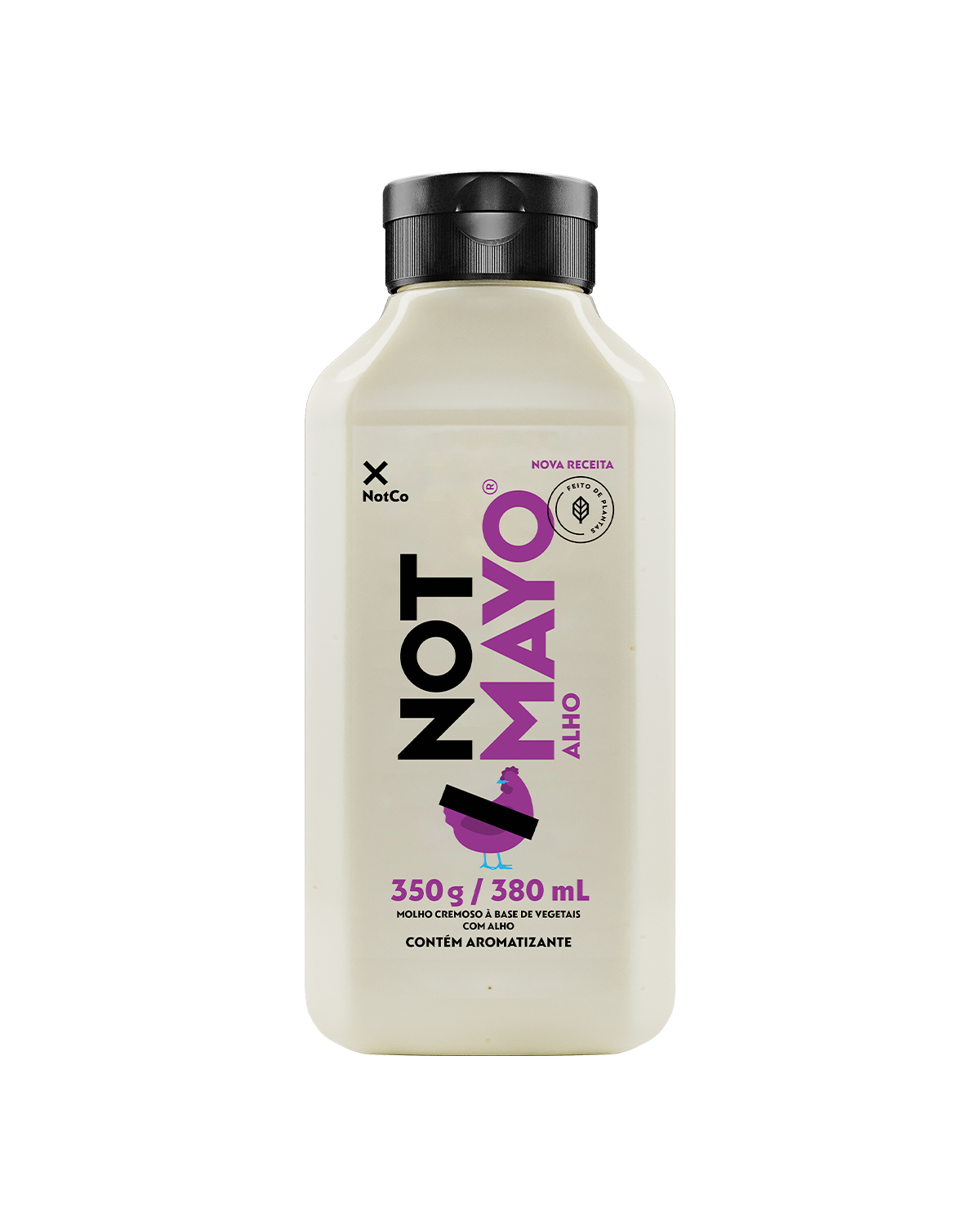
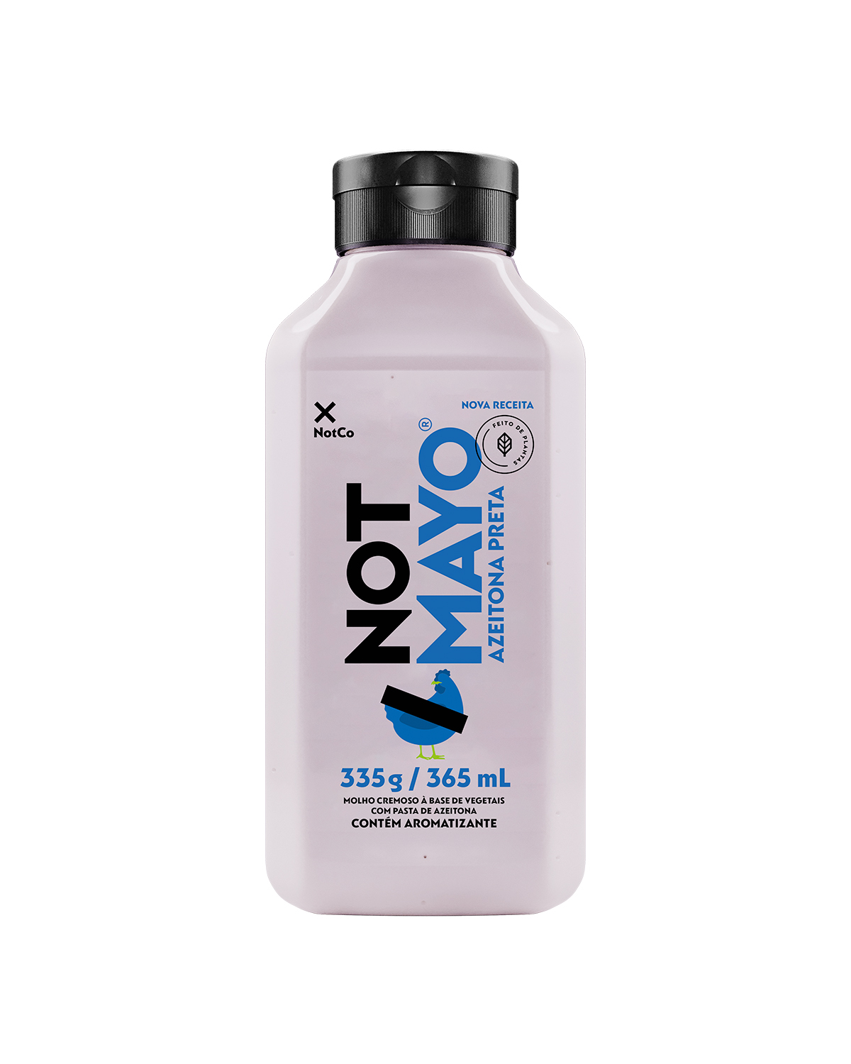
NotMayo
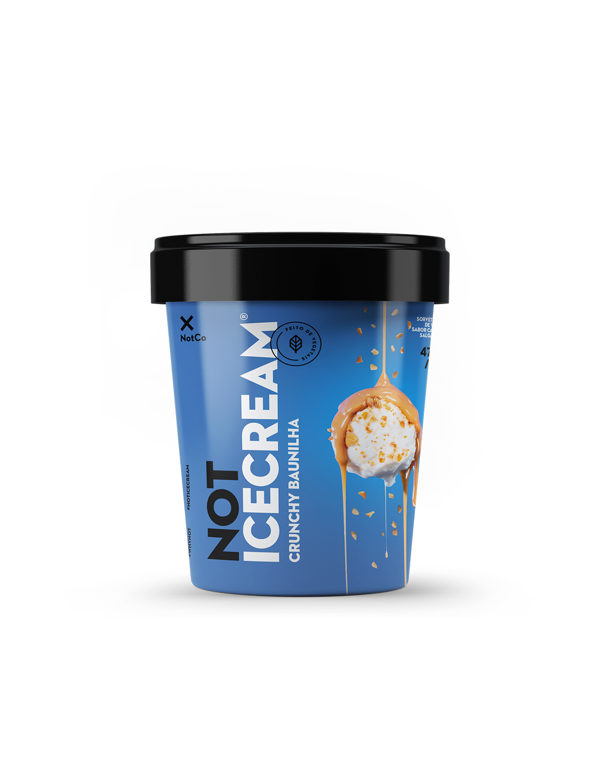
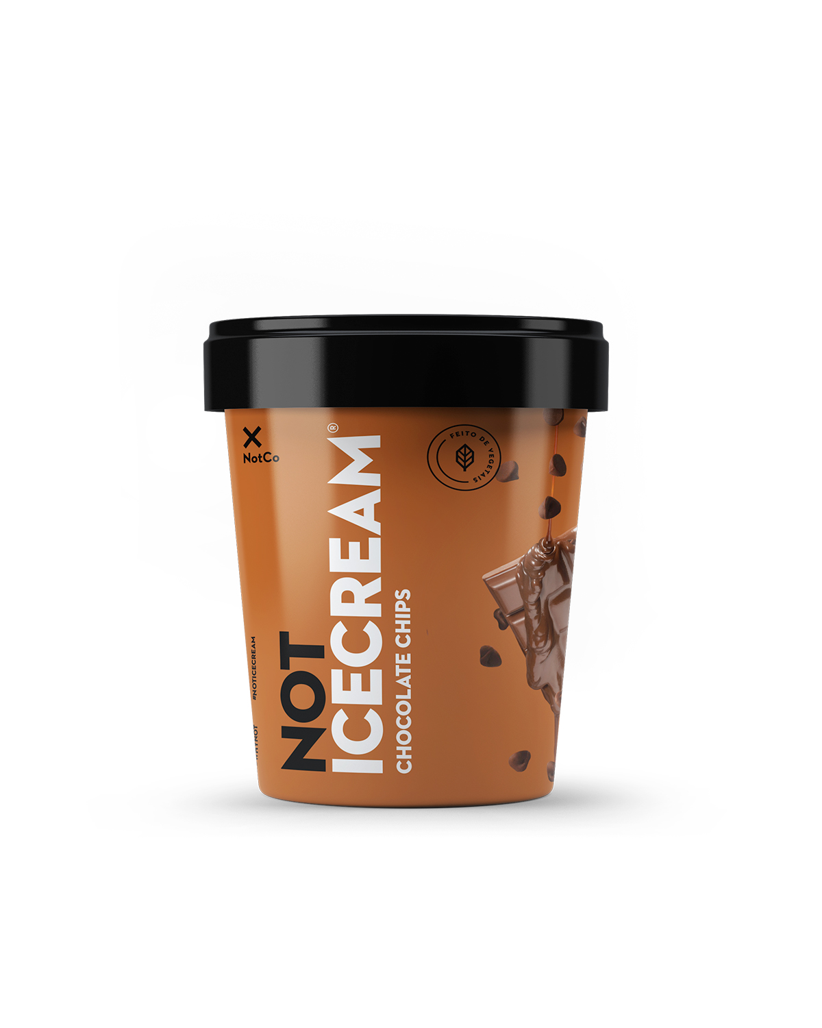
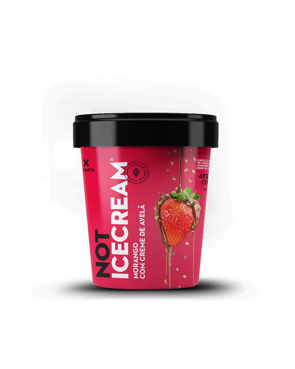
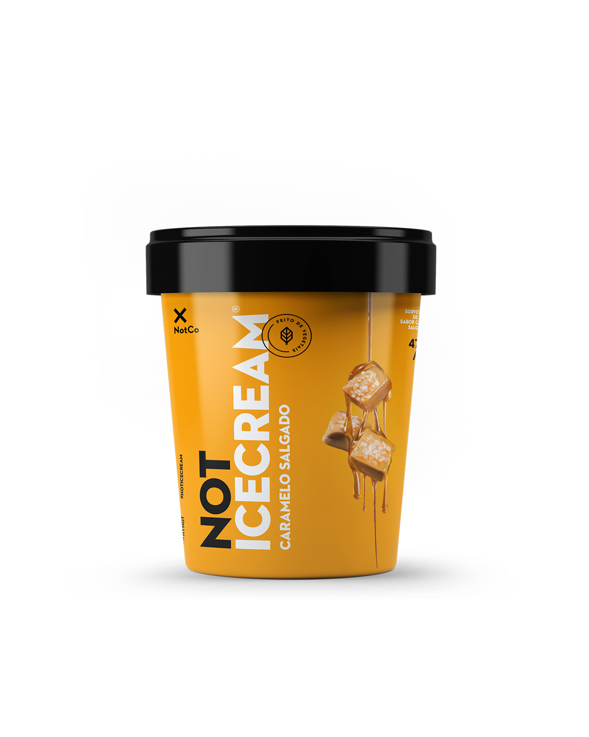
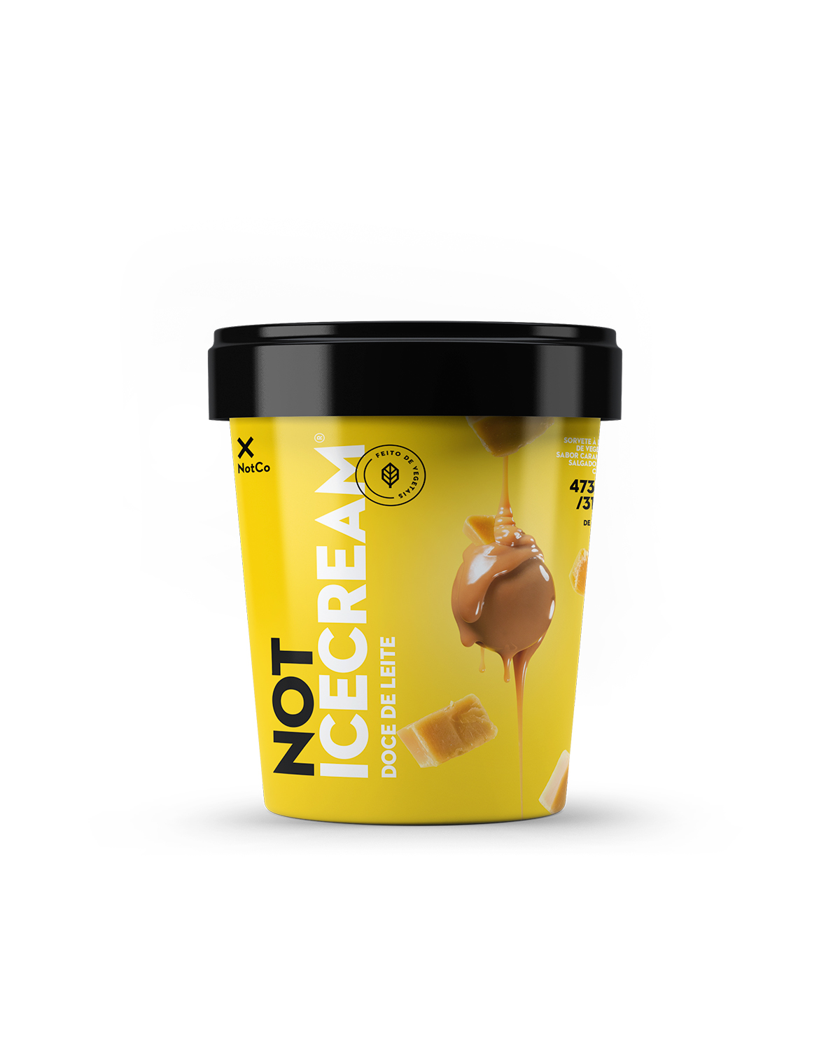
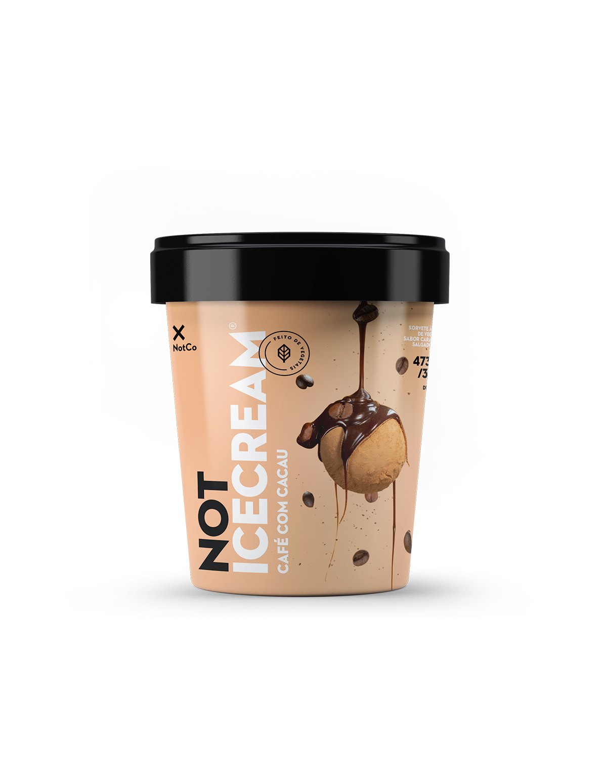
NotIceCream
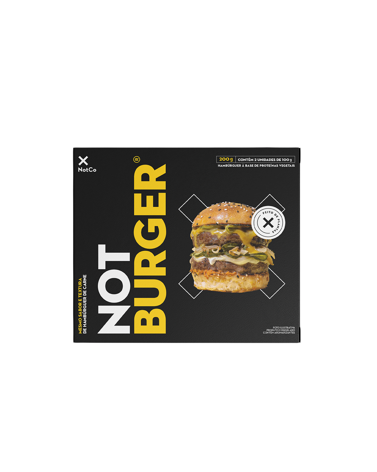
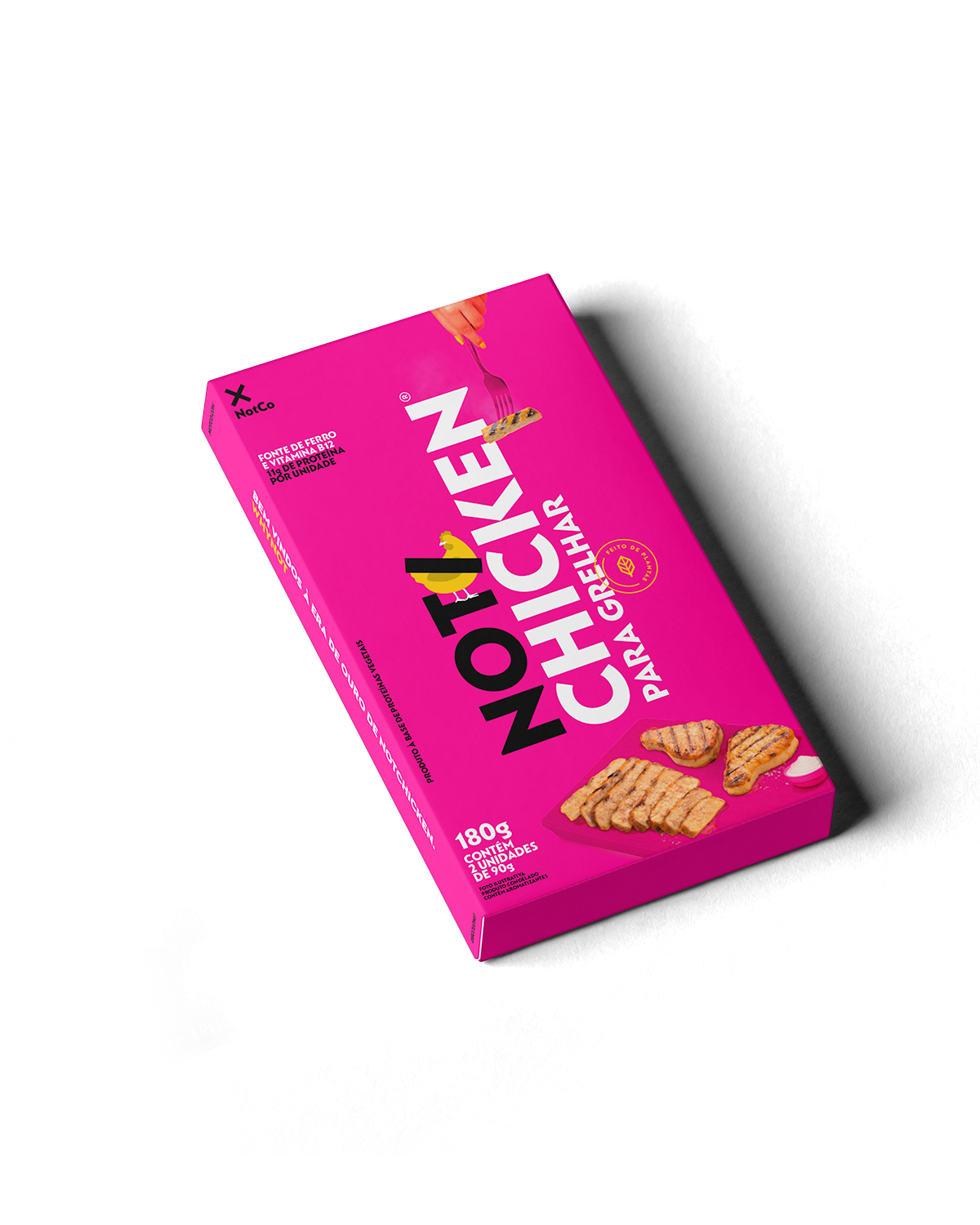
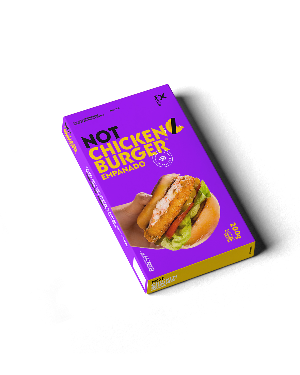
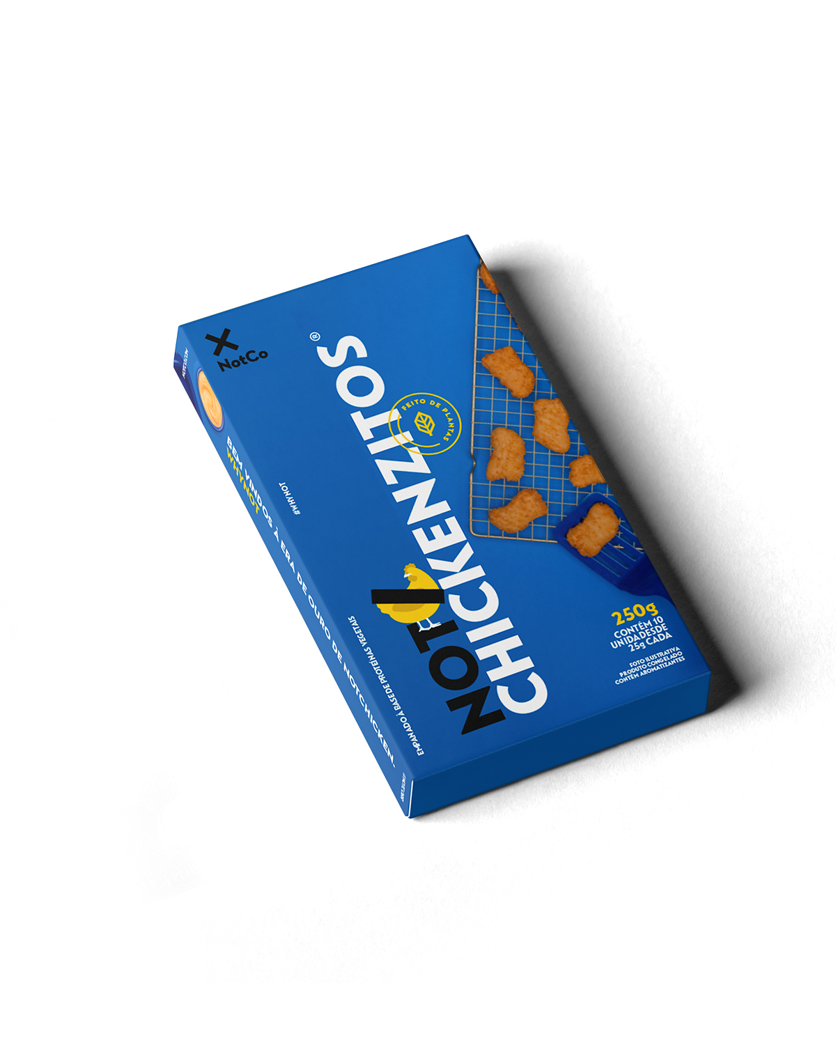
NotBurger & NotChicken
Naming
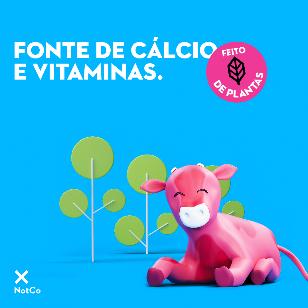
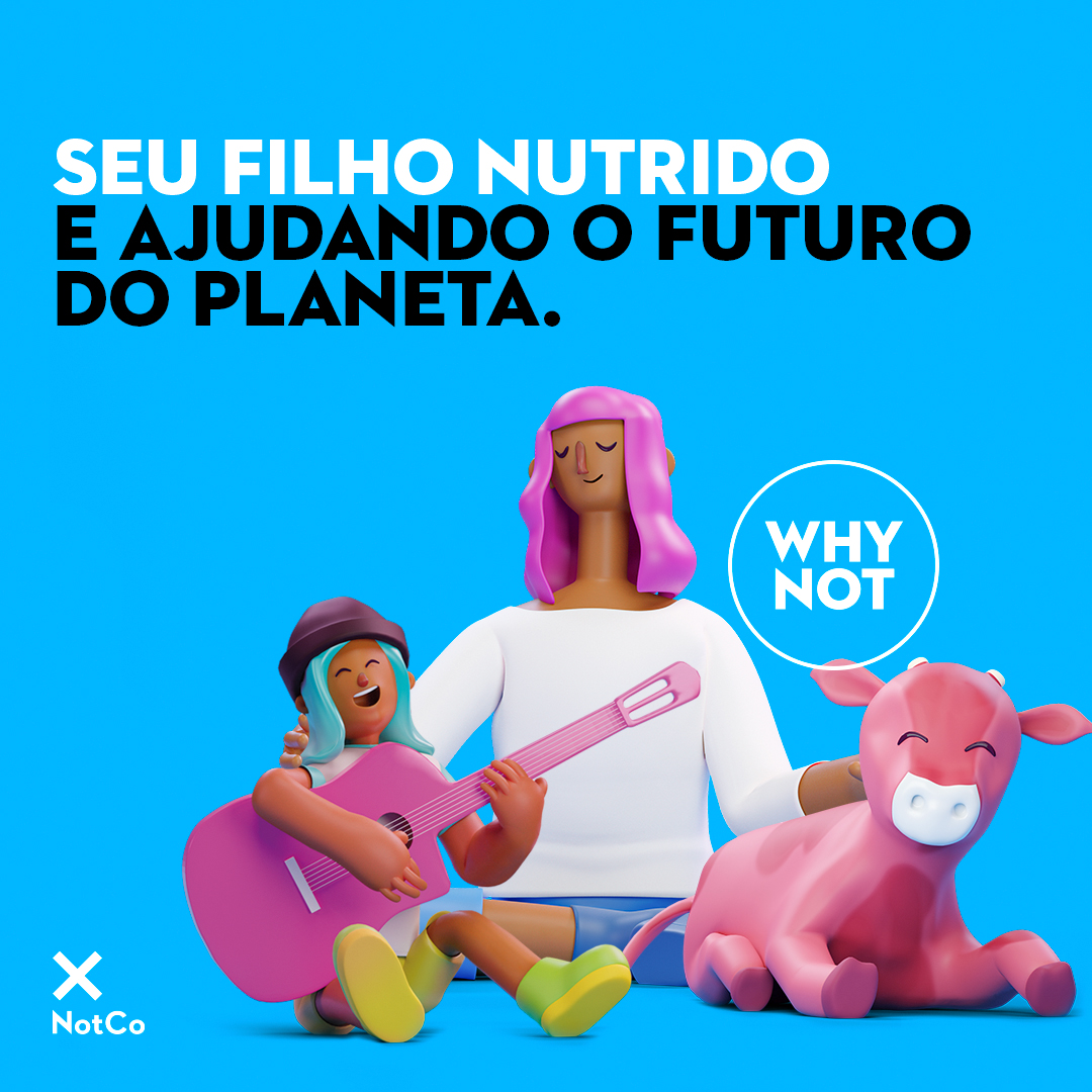
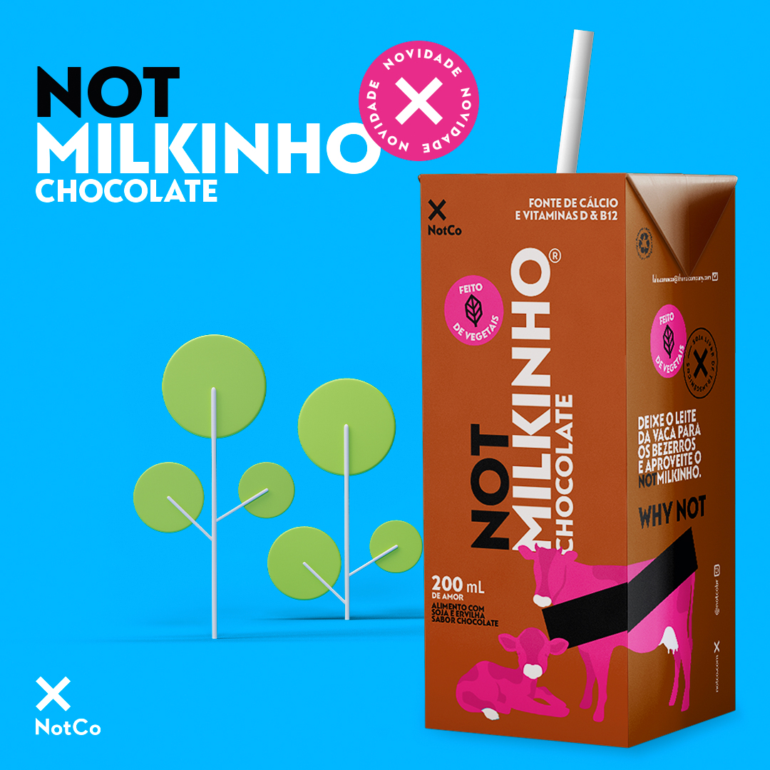
For a children’s plant-based milk, I proposed NotMilkinho. It was approved right away, and the team was using the name before production. Fitting all the mandatory information on such a small carton was its own challenge.
When NotMayo launched a spicy flavour, the naming discussion had dragged on. I presented Picante already applied to the label, and that settled it.
Key visuals
Key visuals for two launches, from the wide master to the pieces that ran on social.
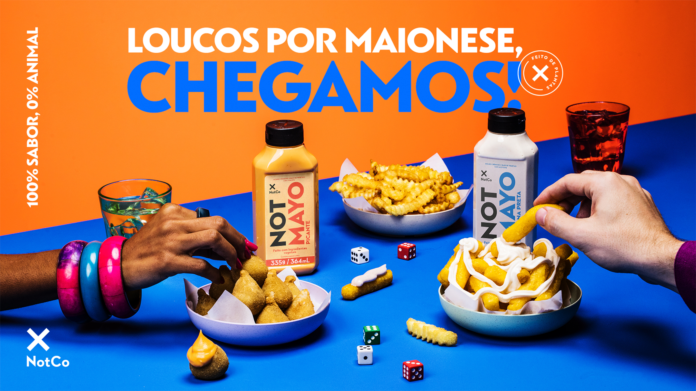
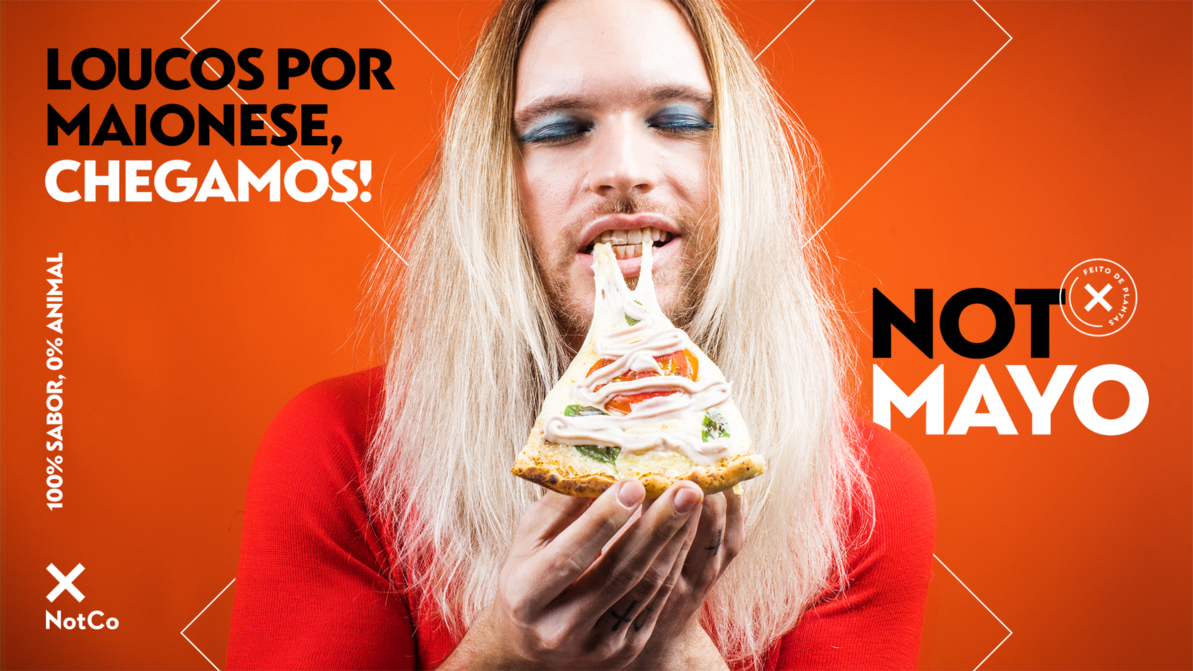
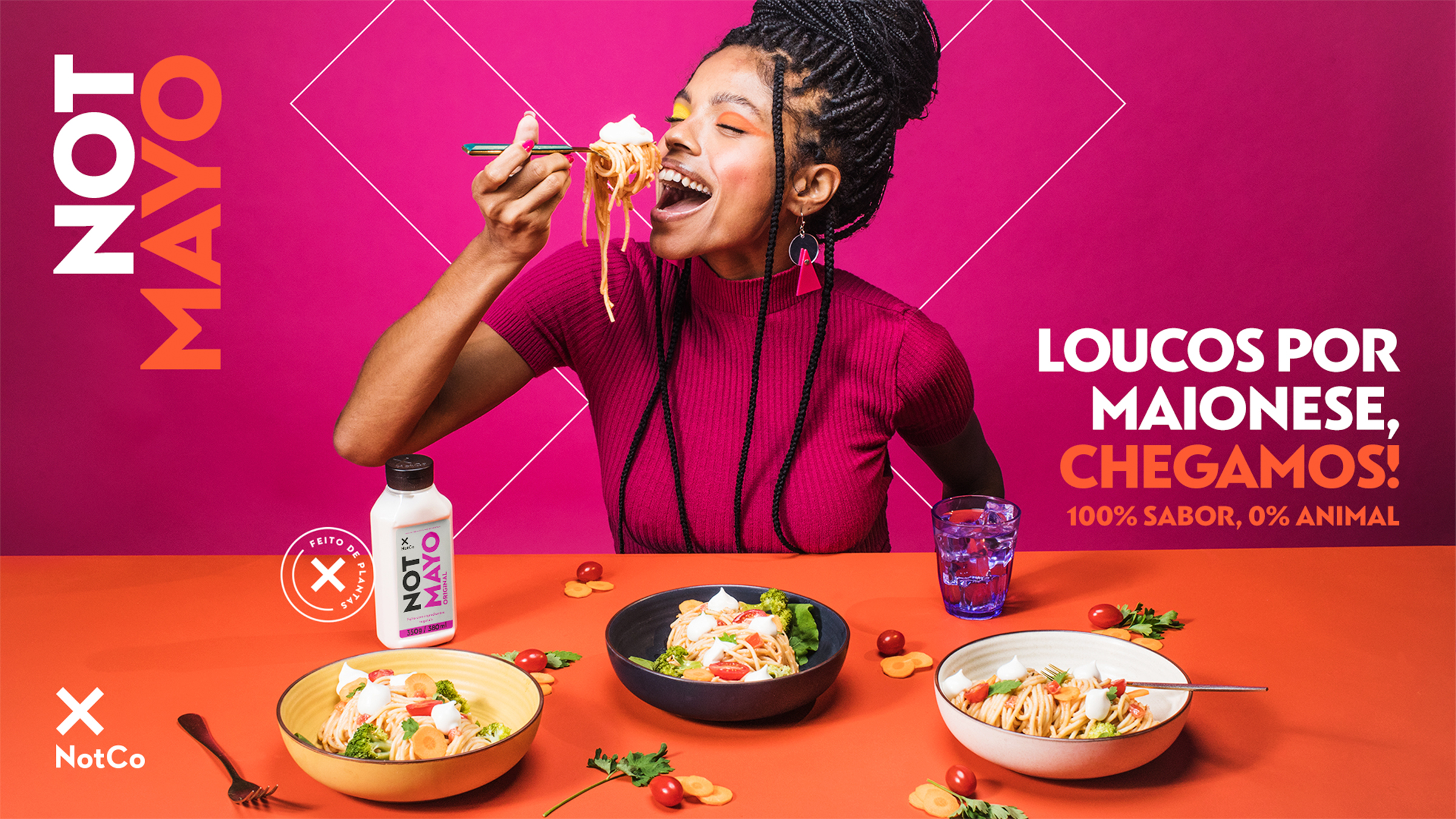
NotMayo
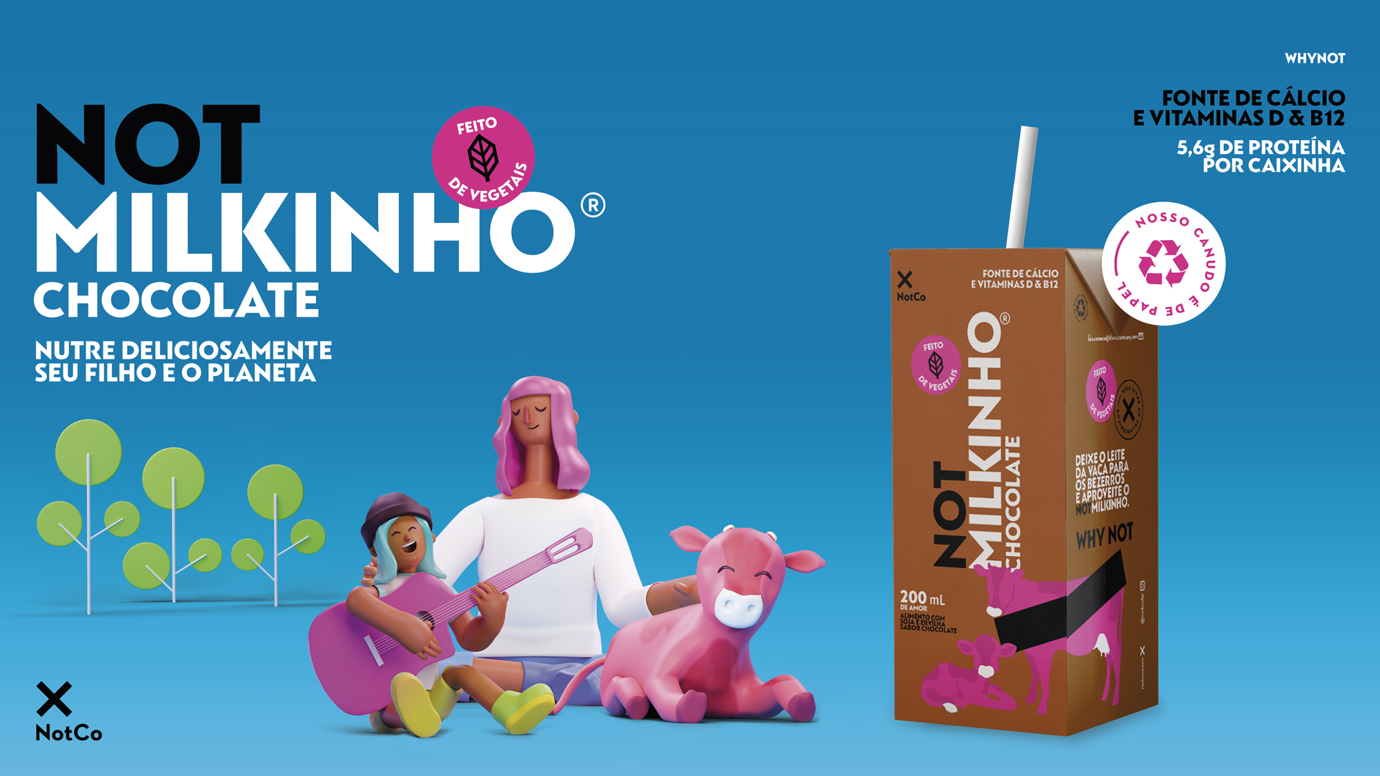
NotMilkinho
Photo shoots
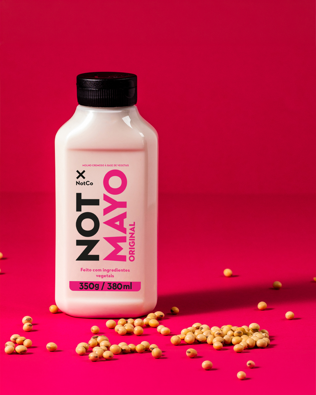
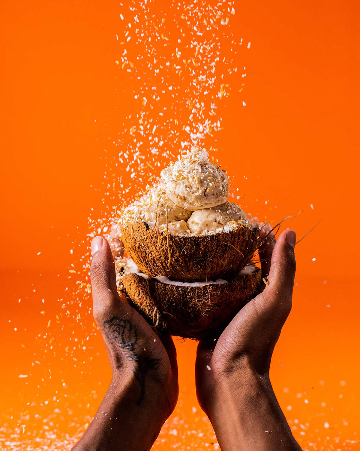
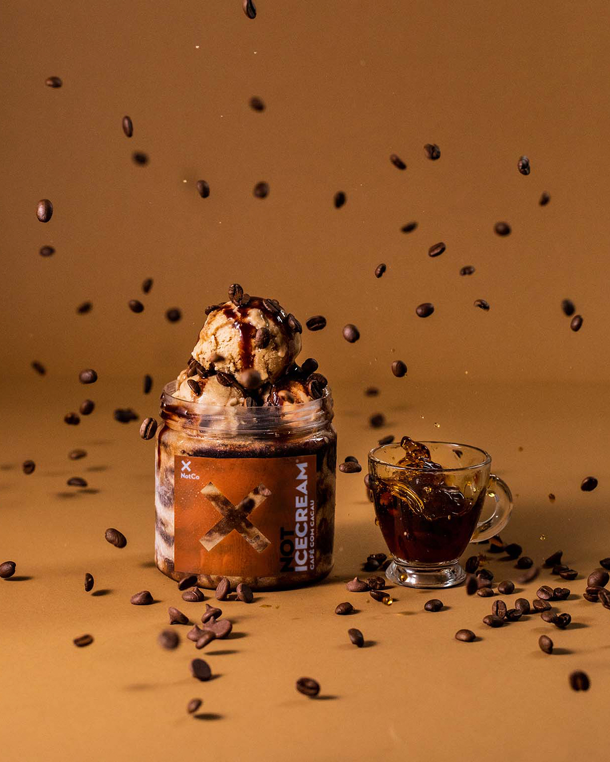
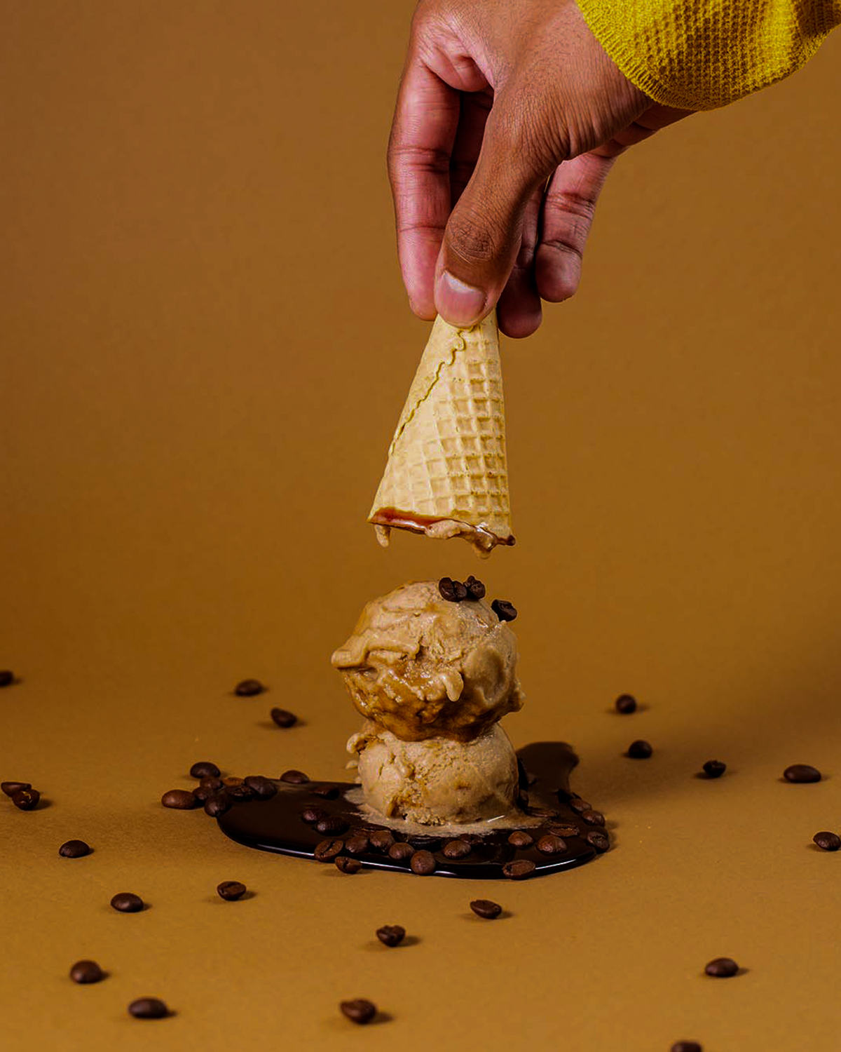
I directed the NotMayo and NotIceCream shoots.
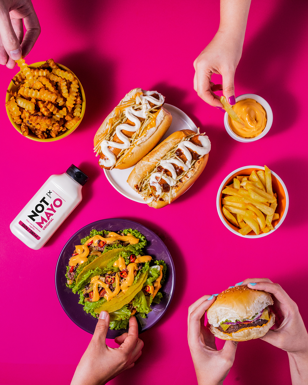
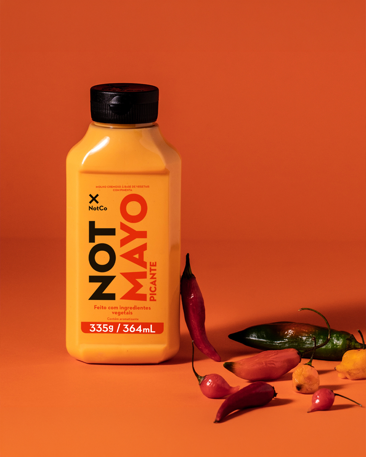
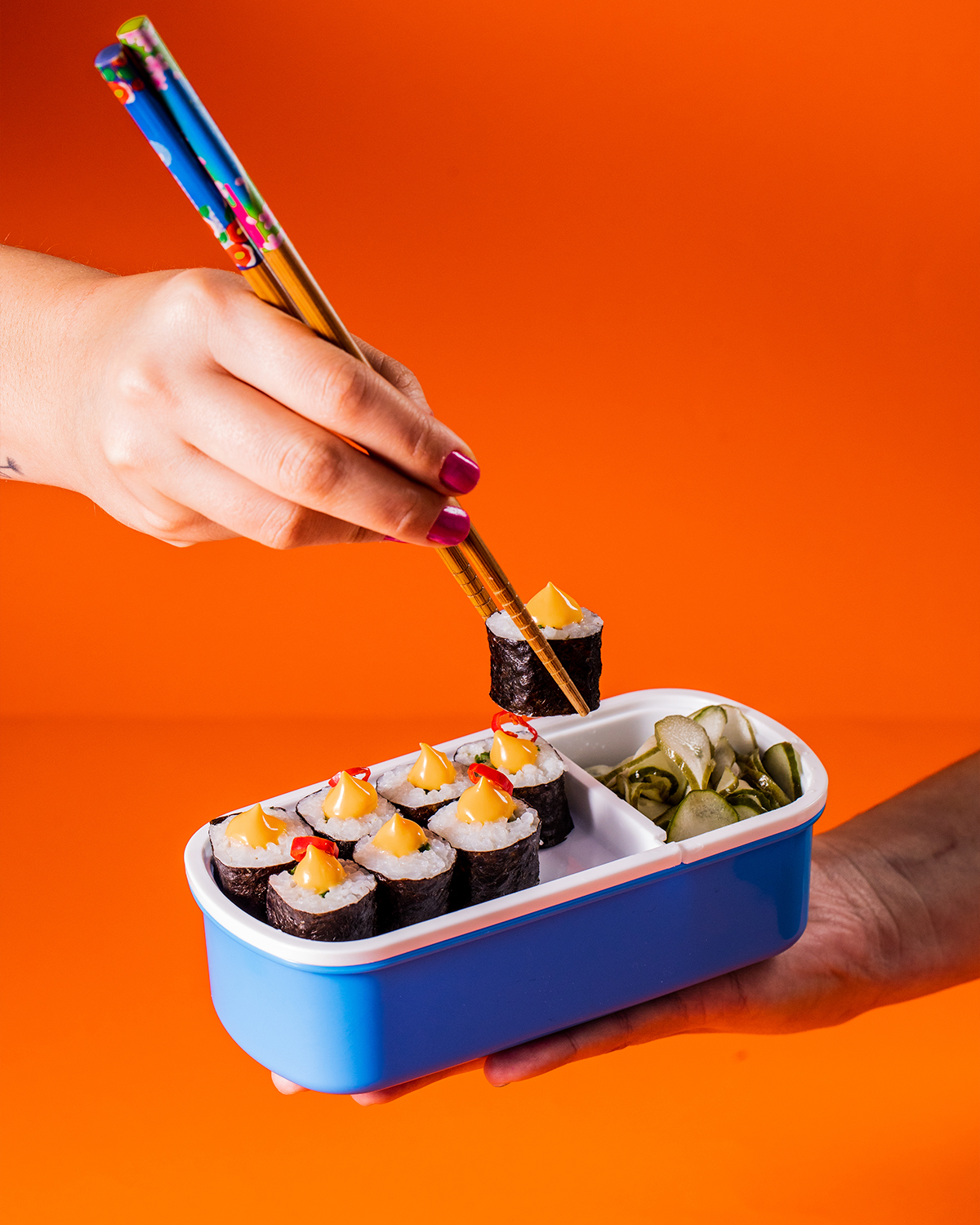
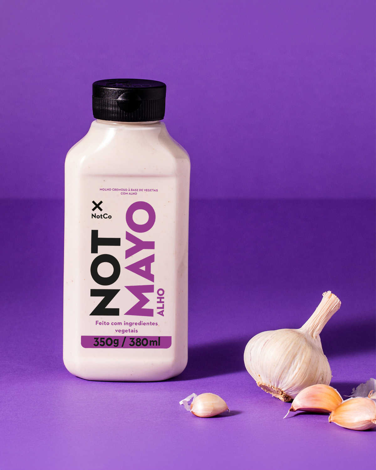
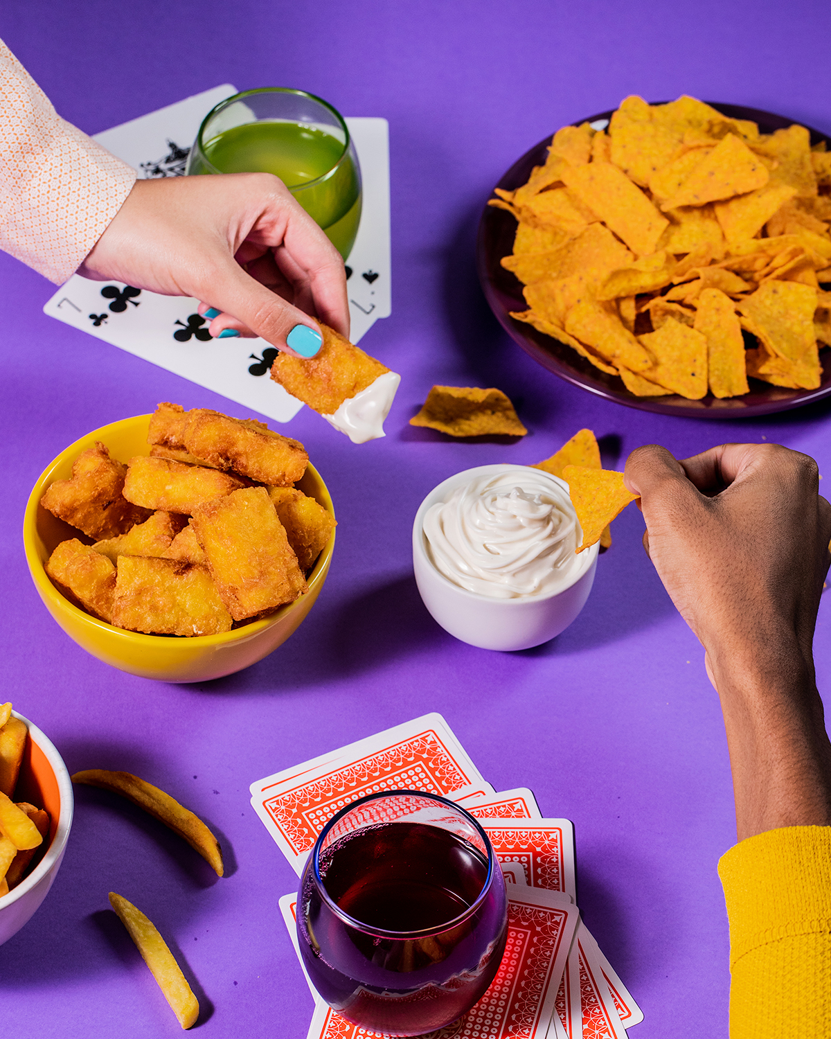
NotMayo
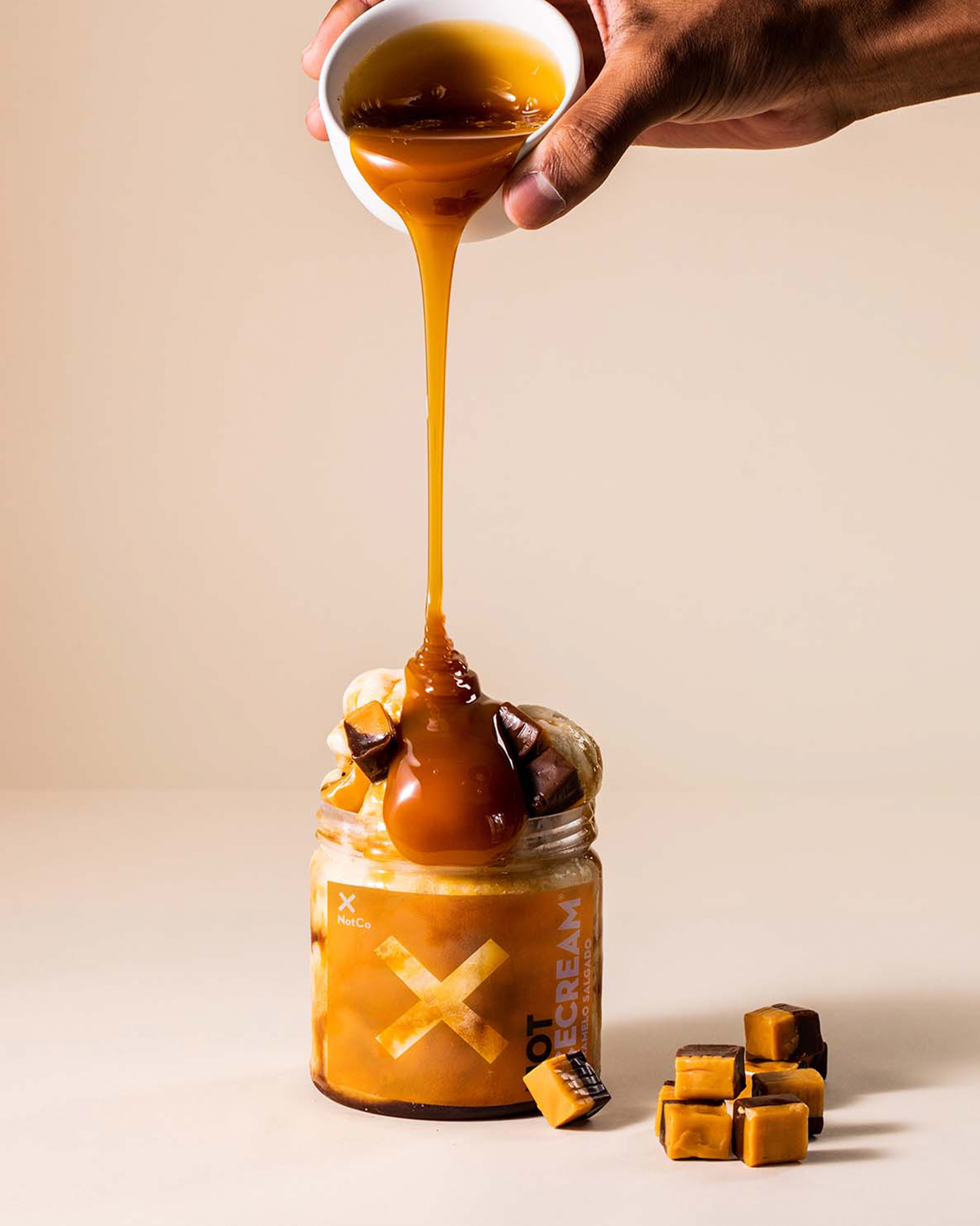
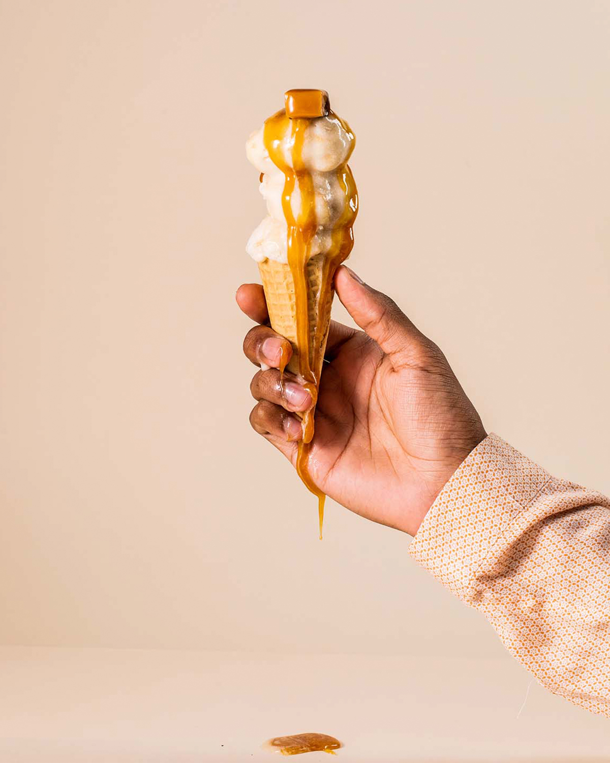
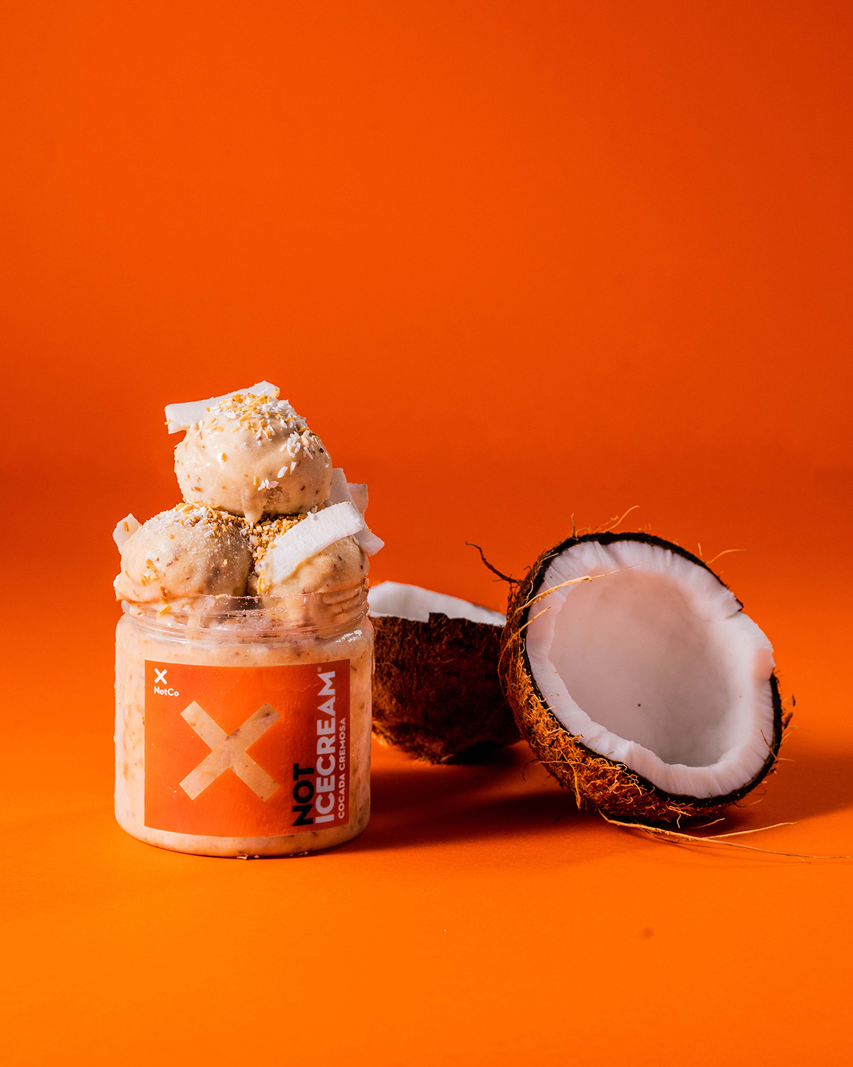
NotIceCream
Results
- Three products redesigned, one adapted and four created for Brazil.
- The colour on the back panel was adopted outside Brazil.
- NotIceCream launched in paper.
- Both names went to market; NotMilkinho is still sold in Brazil.
- The work fed into the brand guidelines I helped build afterward.